Community Behavioral Health
Microsite Design + Development
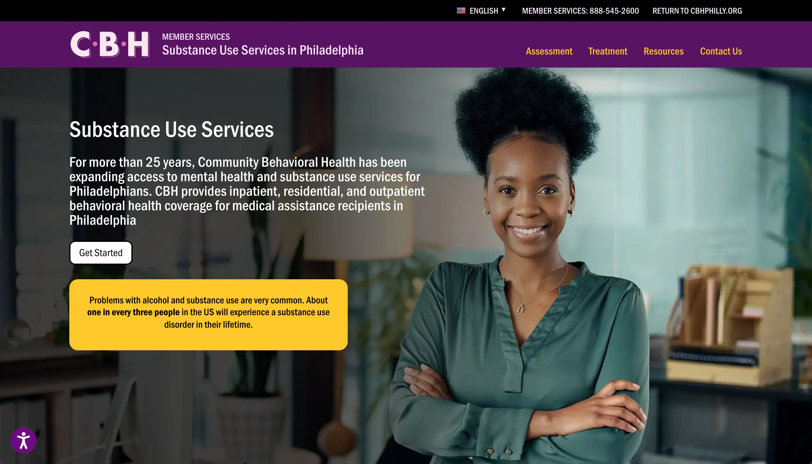
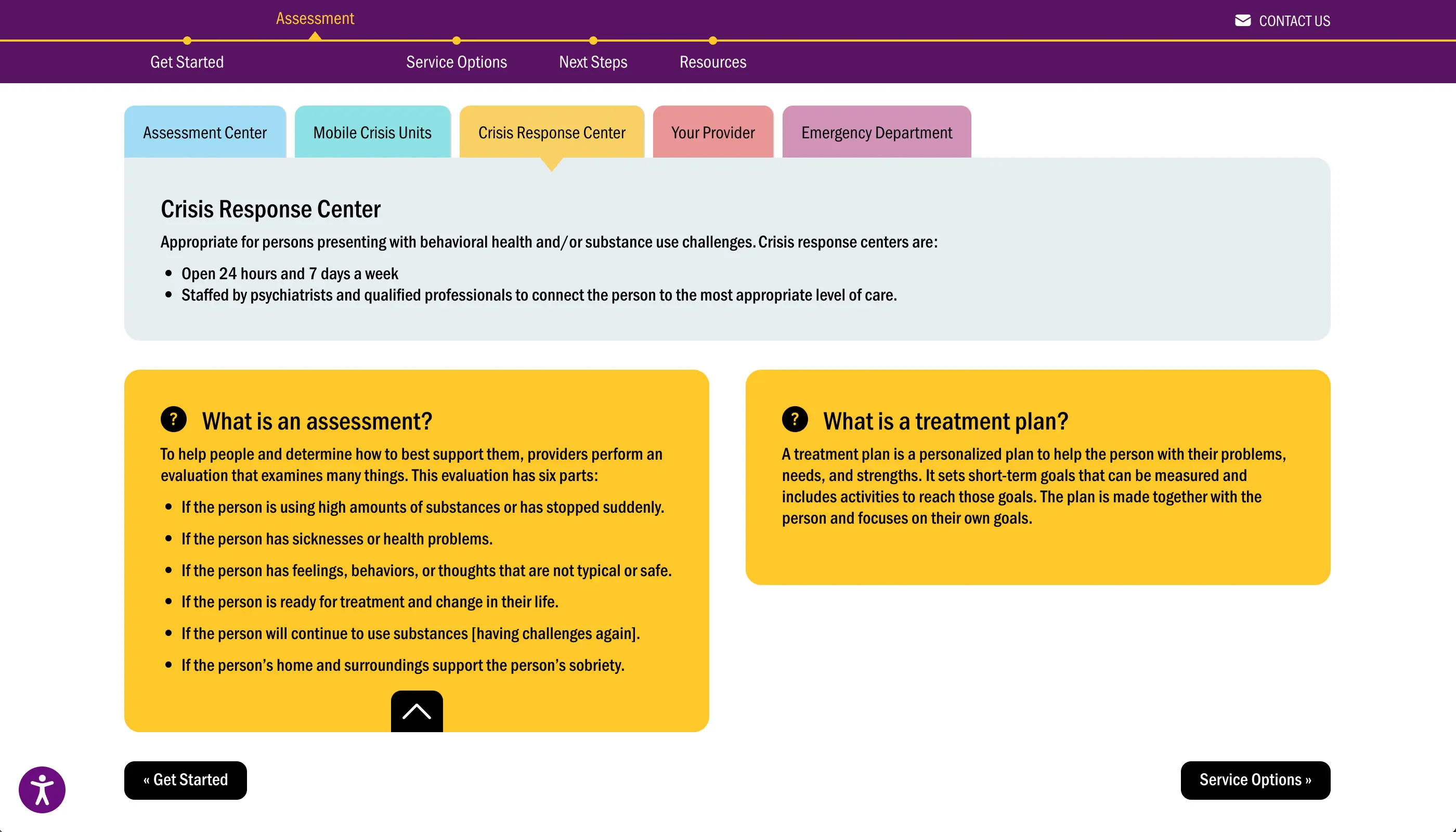
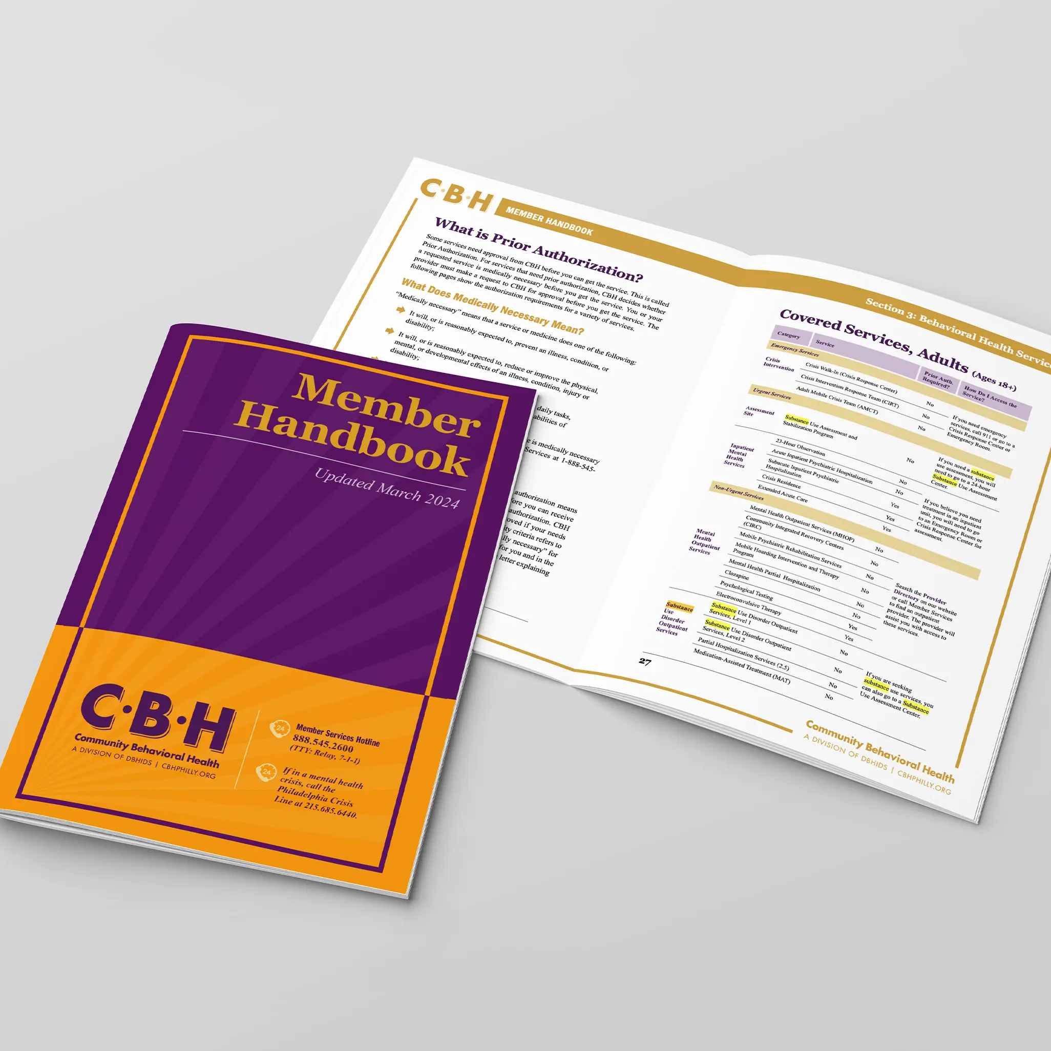
Prior to the creation of the Member Journey, CBH members could only access information on treatment services through a dense 83-page Member Handbook. While the handbook is an incredible resource of information, it poses a challenge for members trying to easily understand their access to services. Additionally, the handbook must be updated manually, causing a delay in posting updates to service guidelines and options.
Creating an easy-to-use Member Journey Online Interface
Community Behavioral Health (CBH) has expanded access to mental health services for Philadelphians for more than 25 years. Their members can receive inpatient and outpatient hospital services for behavioral health needs and substance use disorders through their network providers.
The Problem
The Community Behavioral Health (CBH) website, designed by Blinebury Design, serves as a vital tool for mental health and behavioral service providers. It functions not only as a marketing platform for the organization but also as a valuable resource for updates on provider agreements, billing changes, testing protocols, and authorization criteria.
Additionally, CBH’s members frequently visit the site to find information on how to access crucial services. For many users, particularly those who may lack comprehensive media literacy, finding the necessary assistance can feel overwhelming due to the clinical and impersonal nature of the existing online materials. The primary content for members is housed in the Member Handbook, an extensive 83-page document that details procedures for a range of services. To better serve members seeking help for specific disorders or mental health challenges, CBH needs a more effective way to communicate accessible information.
The Solution
Community Behavioral Health partnered with Blinebury Design to enhance the online experience for members seeking information on treatment options for substance use disorders. After evaluating various possibilities, it was decided that the microsite would be integrated into the existing content management system, which the CBH staff are well-trained and proficient in using. Additionally, the microsite will feature its own distinct on-page navigation system to improve accessibility. We named this project Member Journey.
Rethinking the Content
To enhance our understanding of how members access treatment, the handbook materials were mapped to visualize the options available as well as requirements for members. Initial design concepts focused on reorganizing this content into different modules.
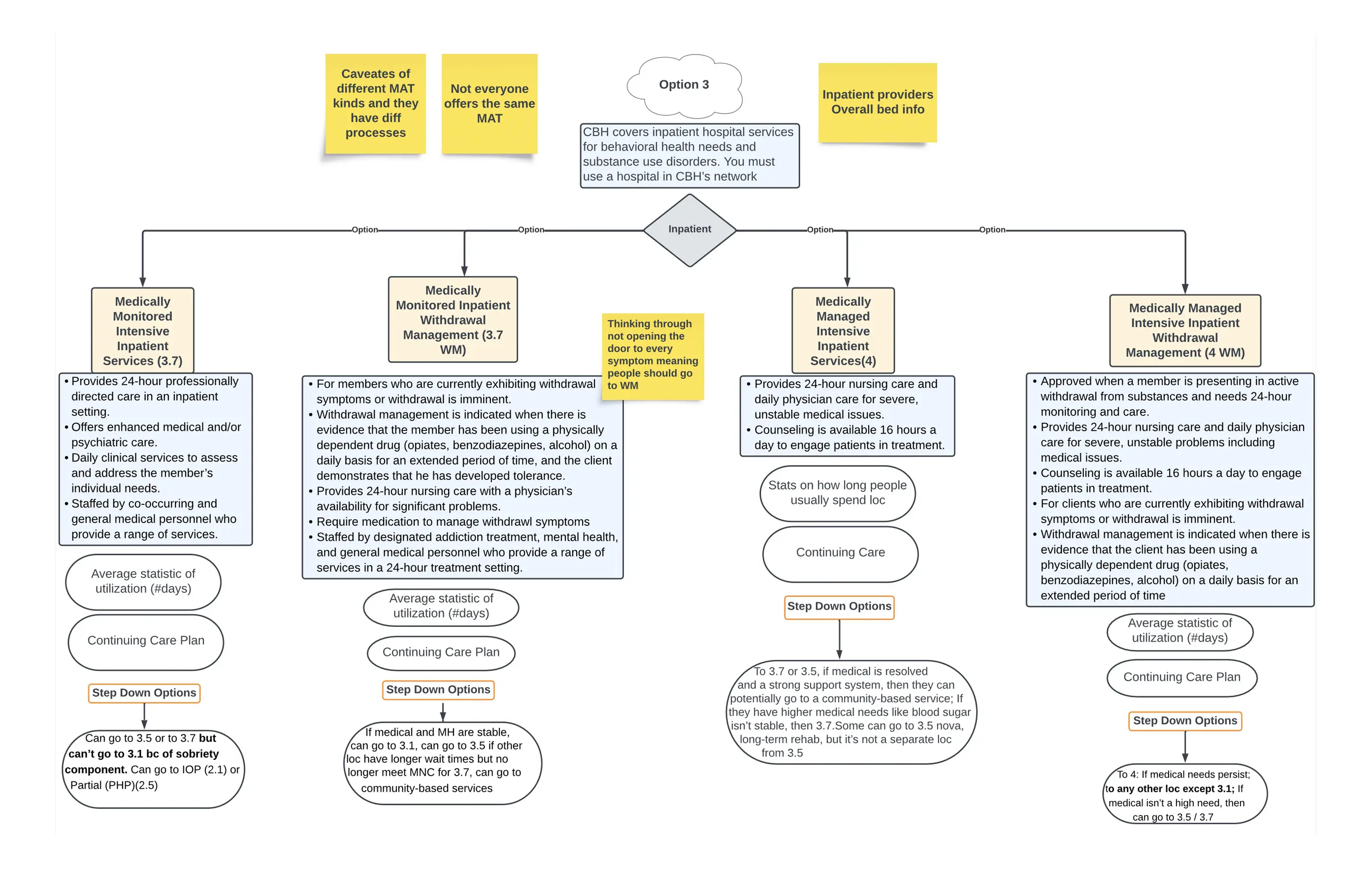
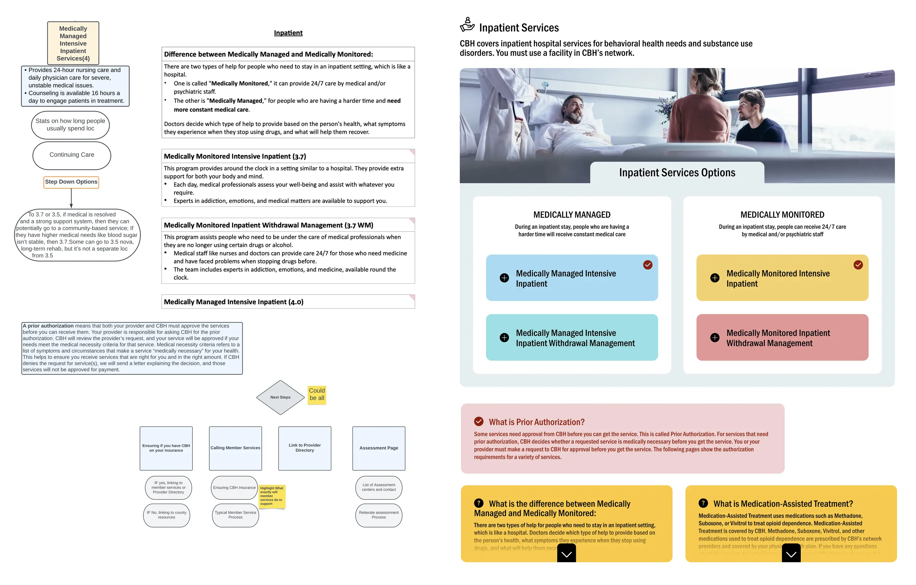
Content map of inpatient hospital services, including codes, requirements and step-down options. There are three treatment options available to CBH members and each has its own unique requirements and authorizations, adding to the challenge of creating a clean visual interface.
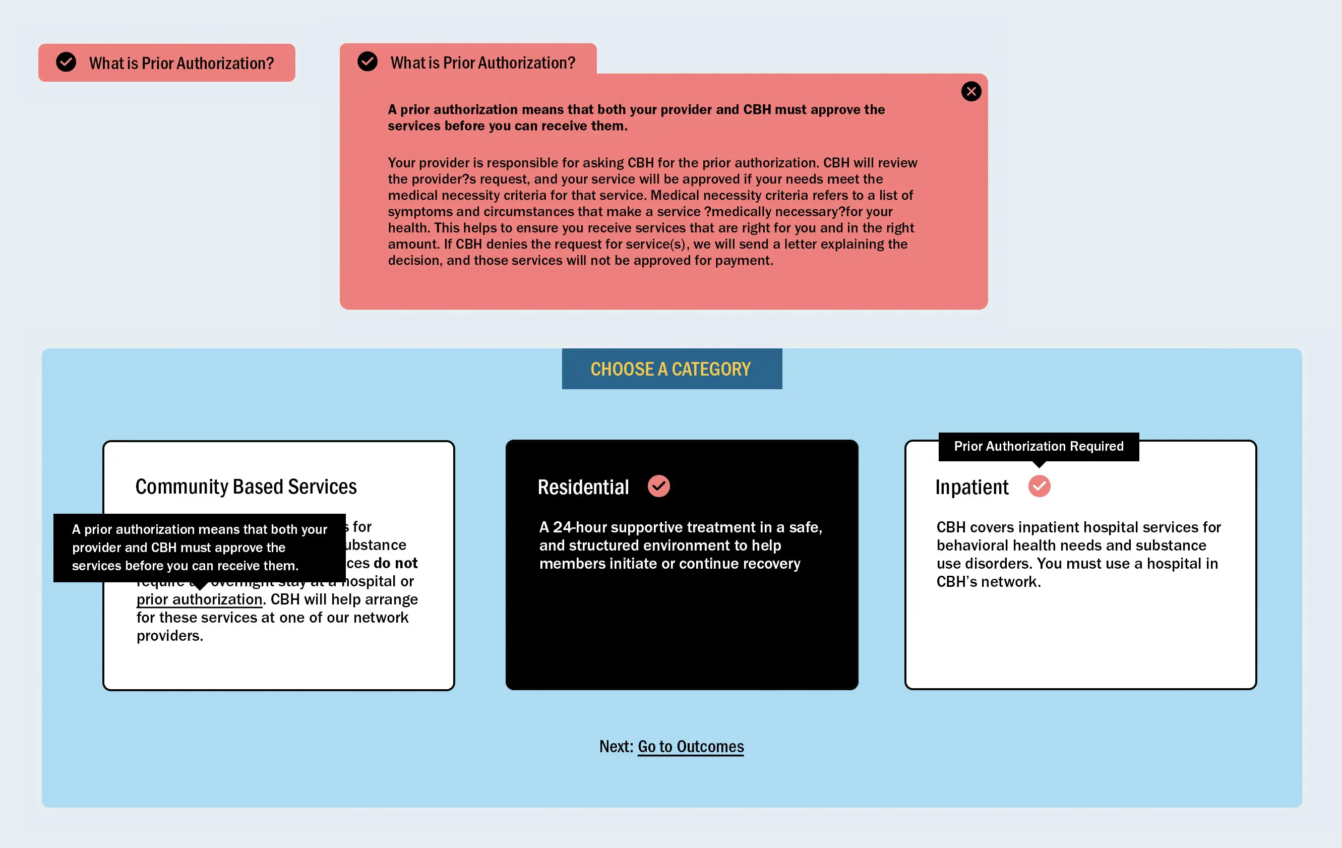
Design concepts were crafted to enhance the diverse content modules essential for the microsite. A major emphasis was placed on language, leading to an exploration of both formal and informal tones as the design elements were integrated.
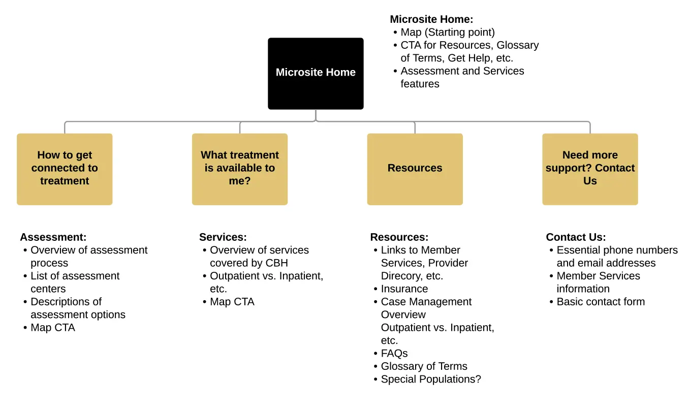
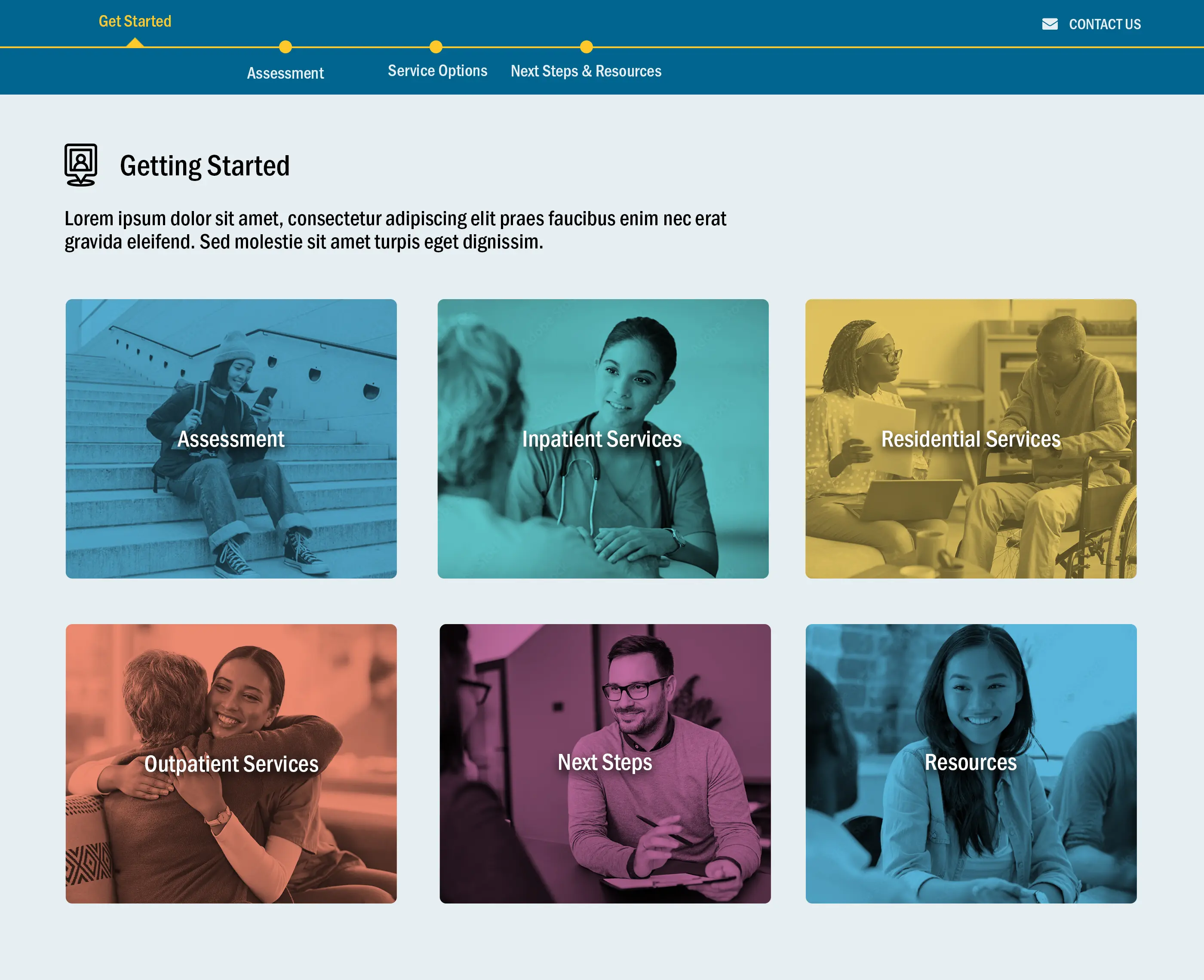
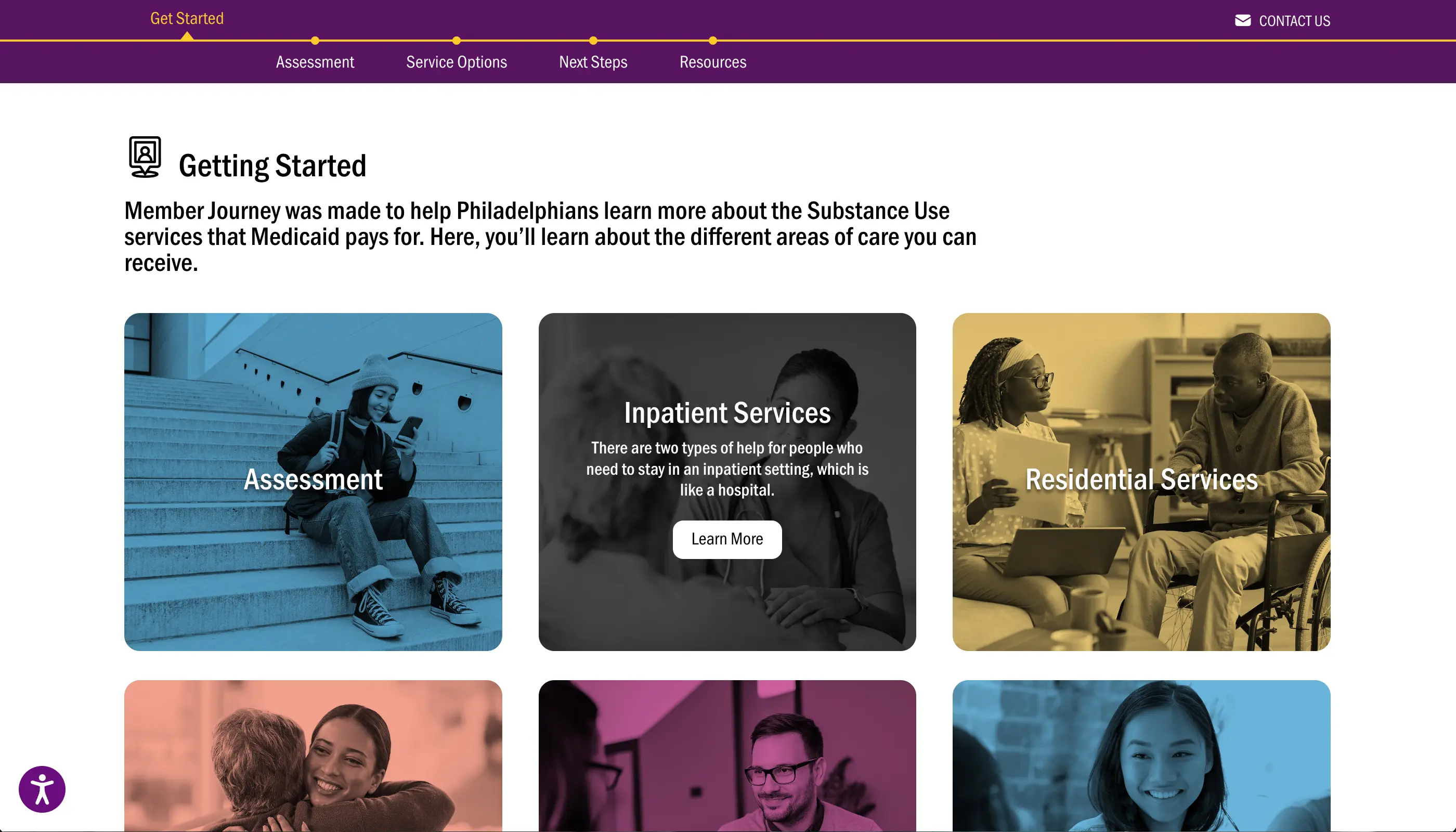
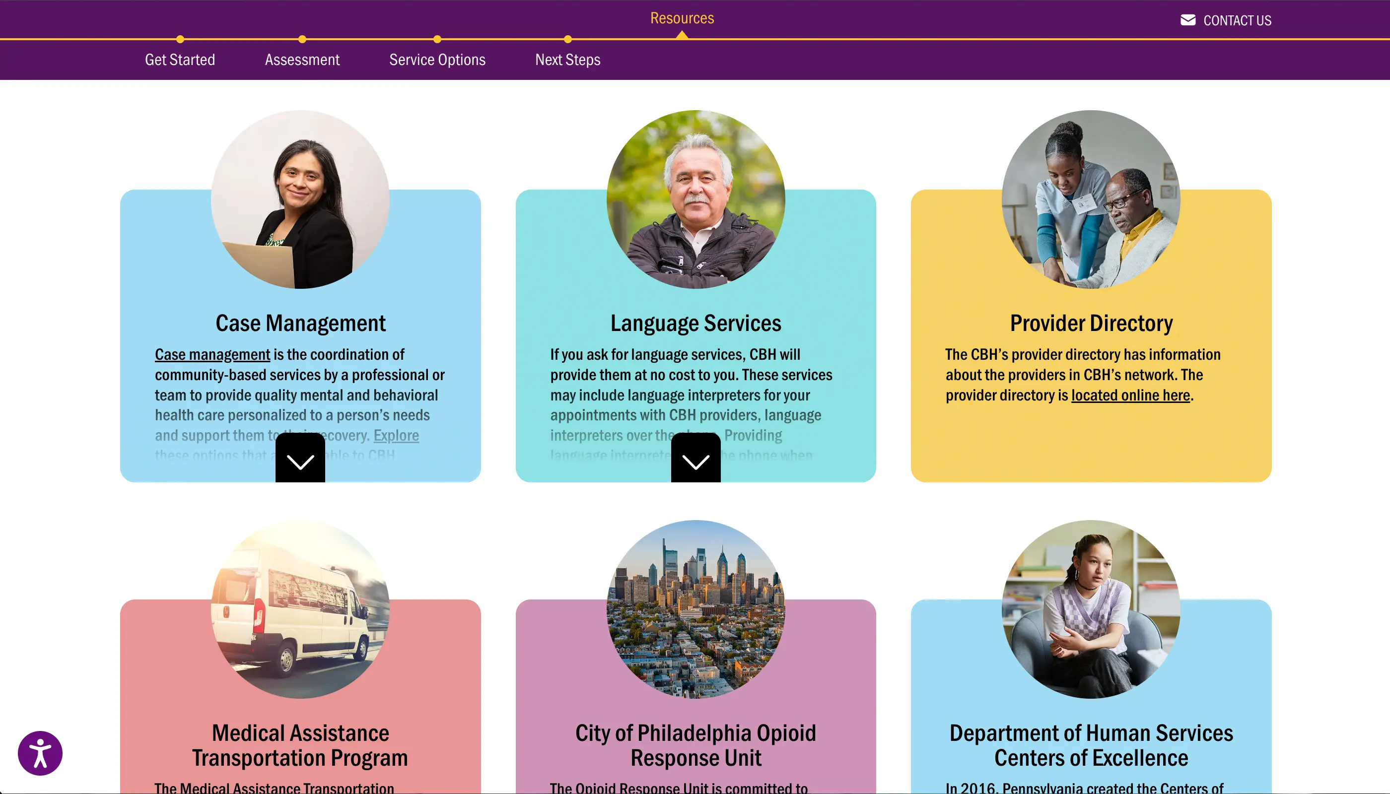
The Member Journey required its own on-page navigation which would guide users from understanding assessment requirements and available treatment all the way to next steps and population-specific options (e.g. language and transportation services).
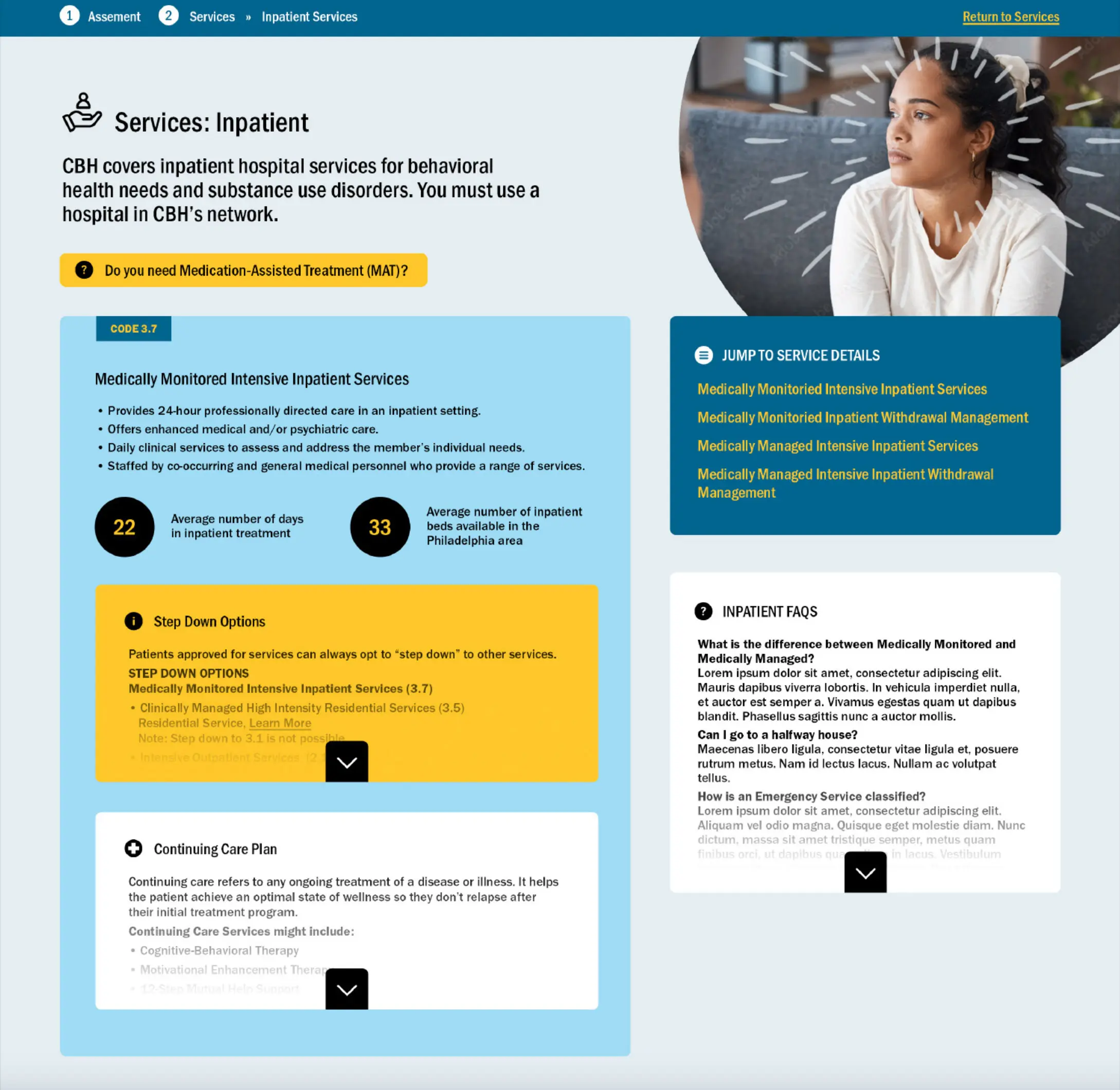
In the initial design phase, we included a variety of content elements from the Member Handbook, including treatment codes and stepping down options. However, we found that the stepping down treatment options were too intricate to incorporate into the online Member Journey. This early design stage helped us pinpoint essential content modules, such as informational boxes and tooltips, that will significantly enhance the user experience. The iterative design process gave the CBH project team the opportunity to revise the text as we explored different design elements.
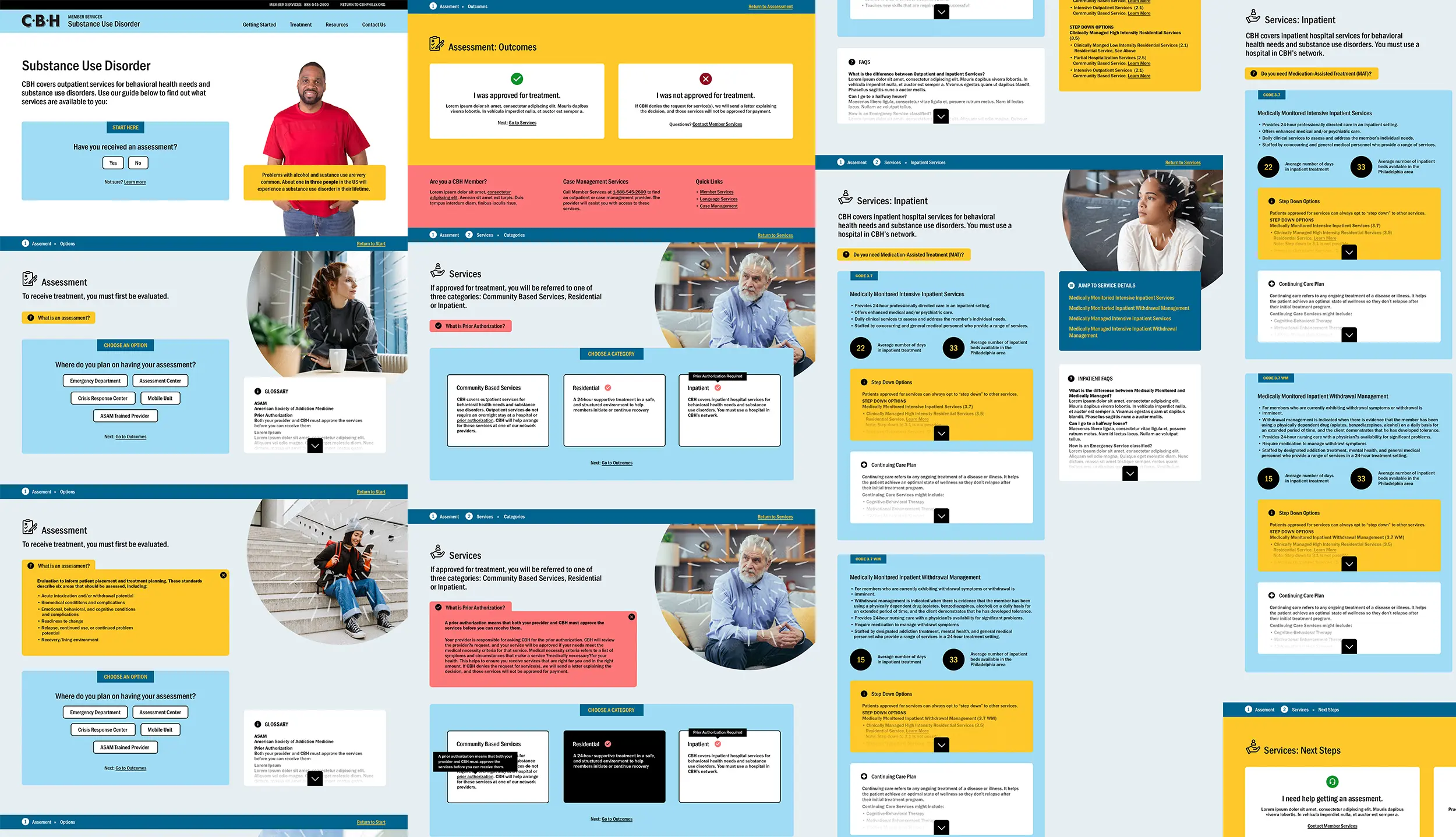
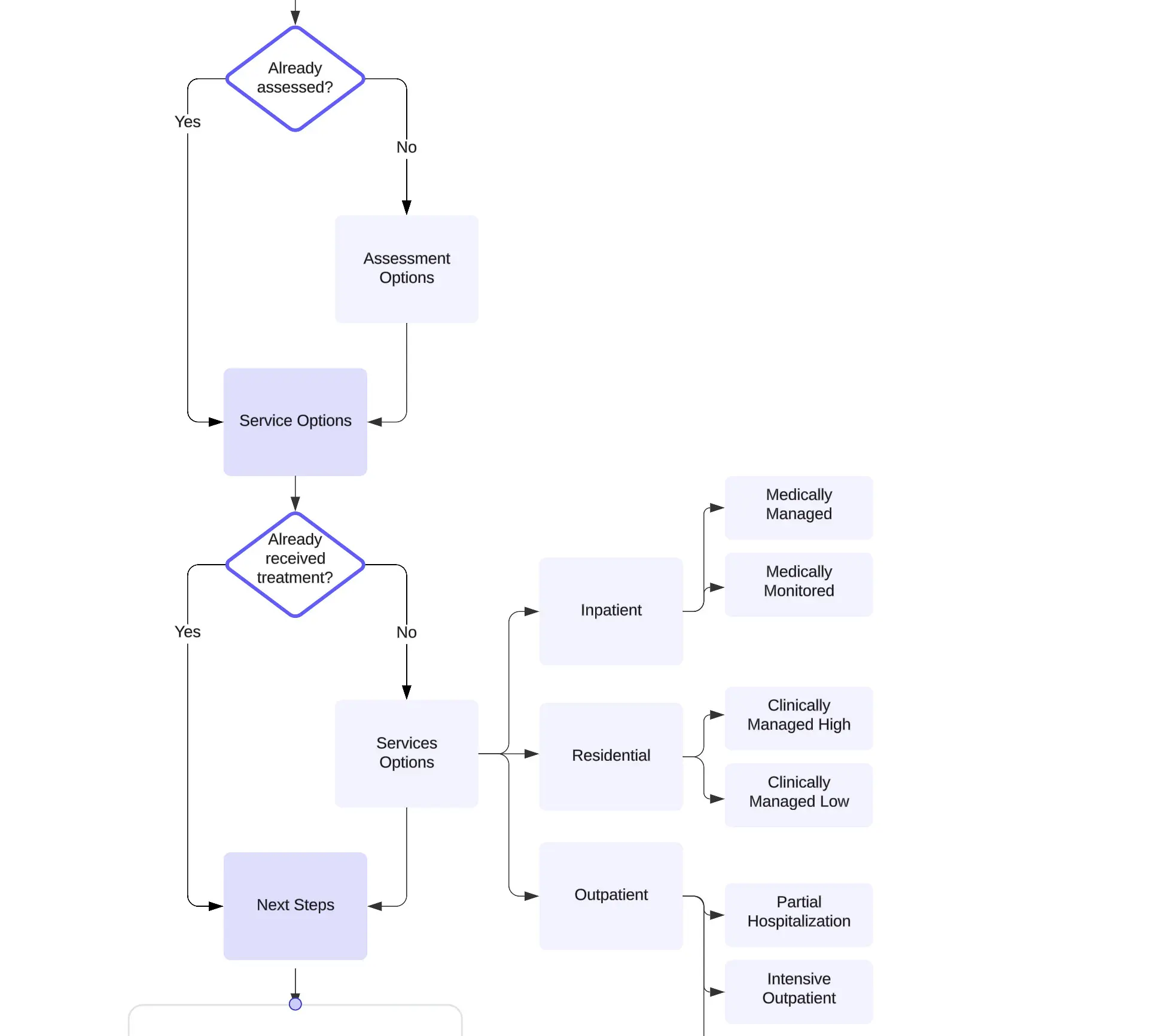
An early user journey map focused on whether or not a member had been assessed.
Mapping the User Journey Flow
The design concept evolved through an iterative process as the project team identified key information for members and established a clear content flow. Ultimately, we opted for a single-page layout that allows users to easily select their options, minimizing excessive content that could overwhelm them.
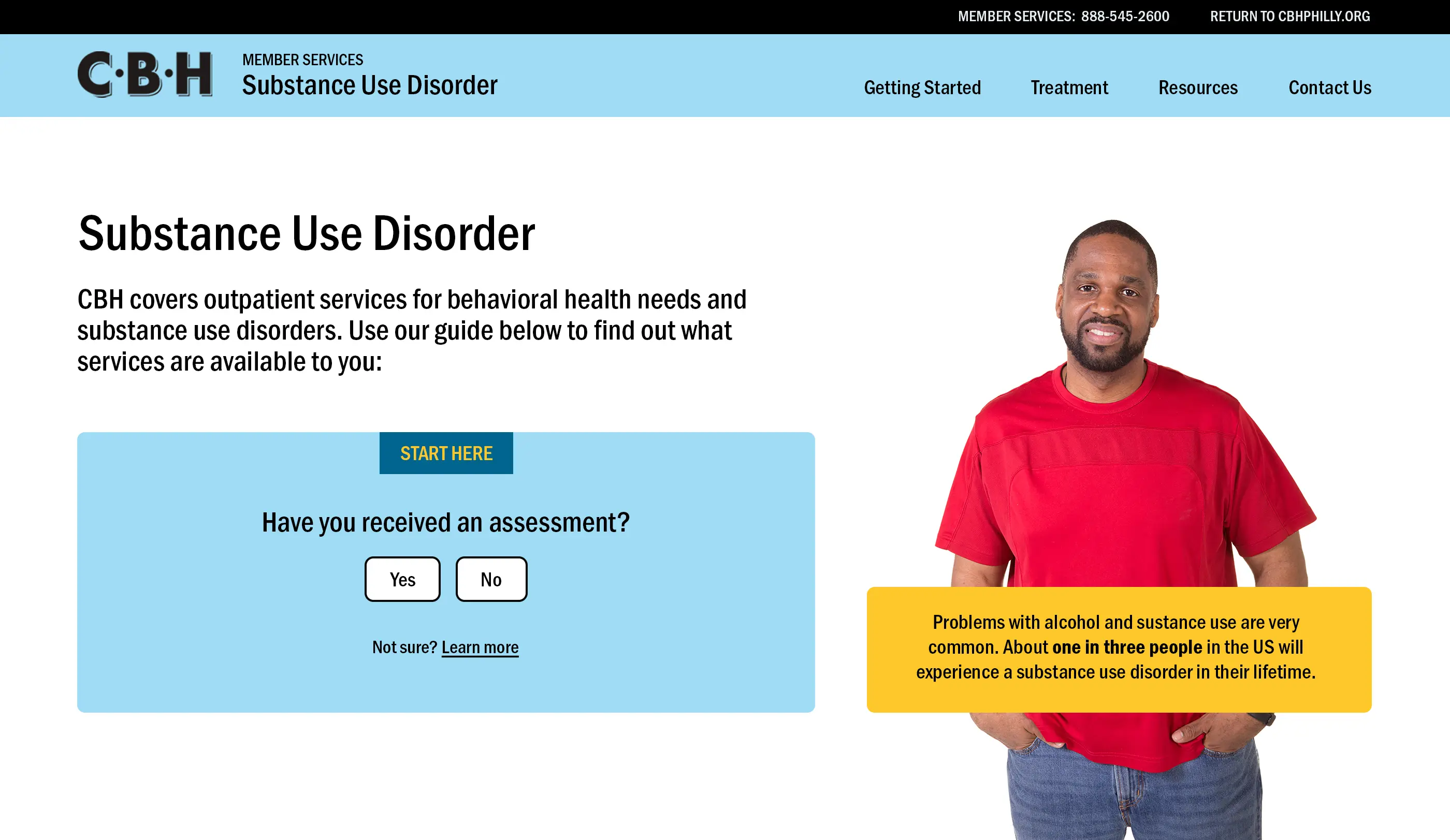
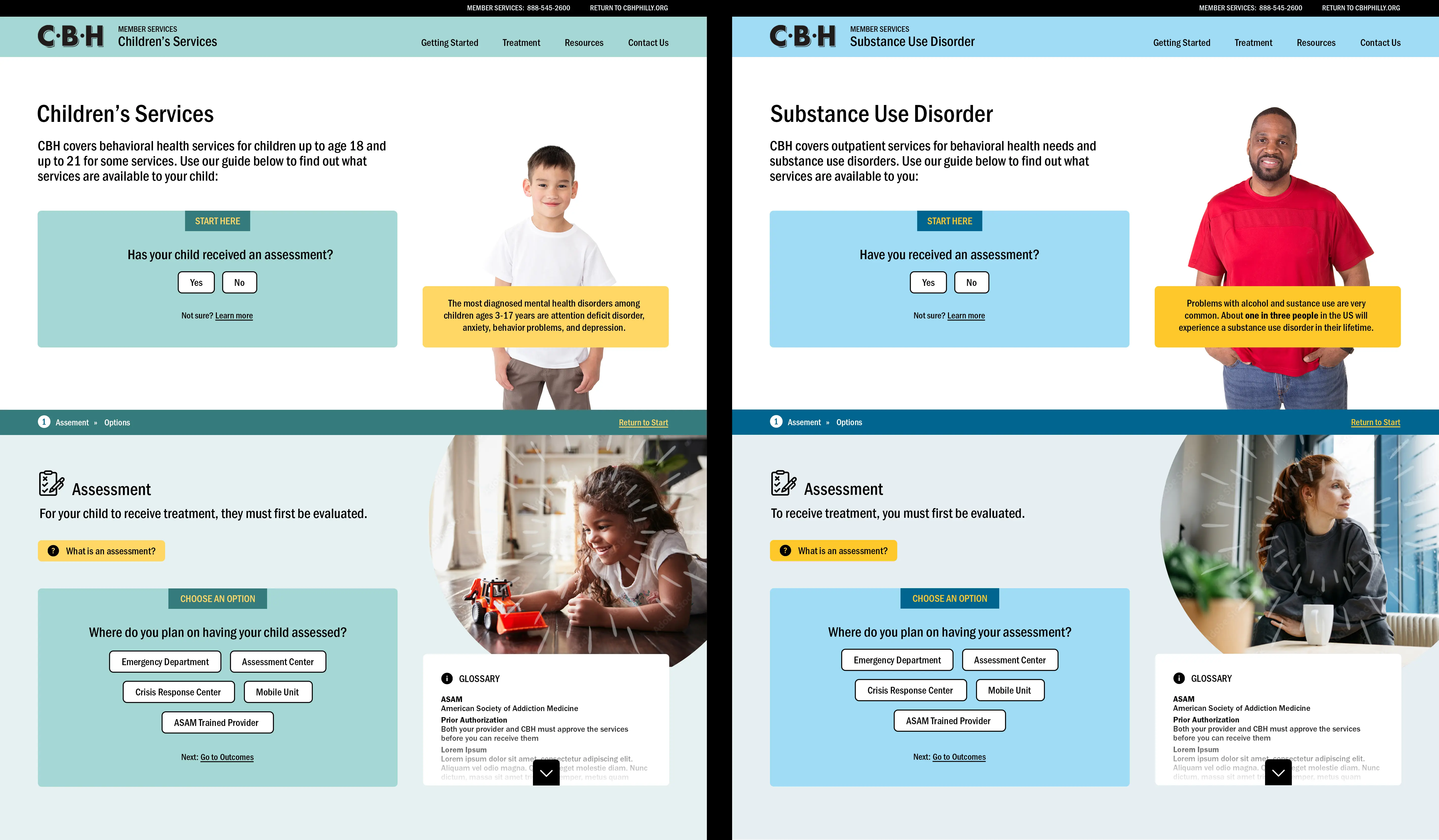
Early design concepts reflected the original user journey flow which required users to specify whether they were assessed or not. This approach evolved into the final concept which allows users to choose any area of microsite content they wish.
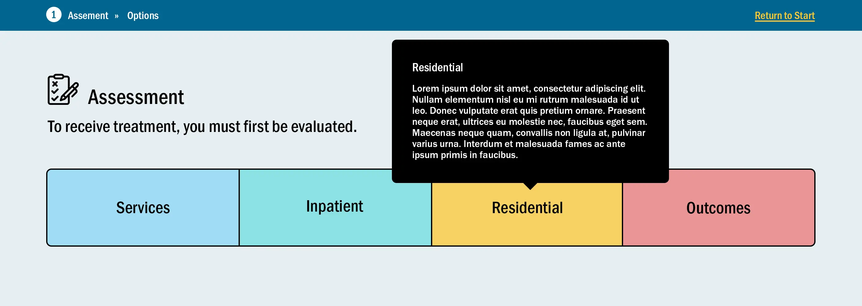
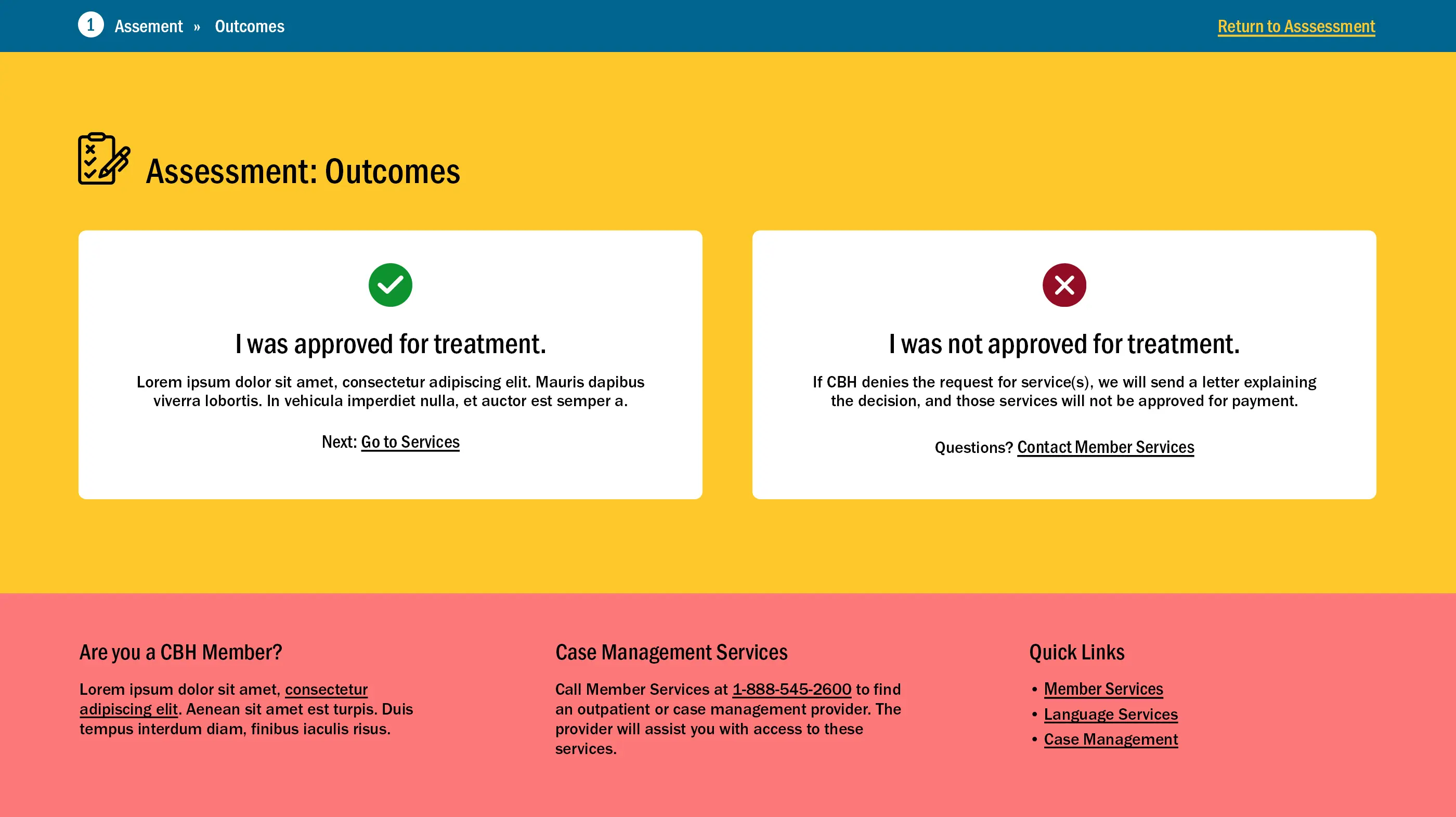
The process to receive treatment can be quite involved and time consuming. Members do not have access to an online portal to request services. The Member Journey microsite is meant to walk members through to next steps through clear messaging and an effective user interface.
Planning for the Future
During the discovery phase, the project team identified the importance of incorporating photography and a vibrant color palette into the microsite to create a more inviting atmosphere around the clinical content. The microsite was carefully developed with future iterations in mind, featuring distinct color palettes for each service area. With the aim of transforming the entire CBH Member Handbook into a user-friendly online experience, the initial design concepts were created to share design assets and content modules.
Refining the Design
Through an iterative design process, working closely with the CBH project team, Blinebury Design worked to define goals around messaging, editing content to be more approachable. These updates to the complex original content dictated changes to the design modules and the overall user journey flow.
Defining Outcomes
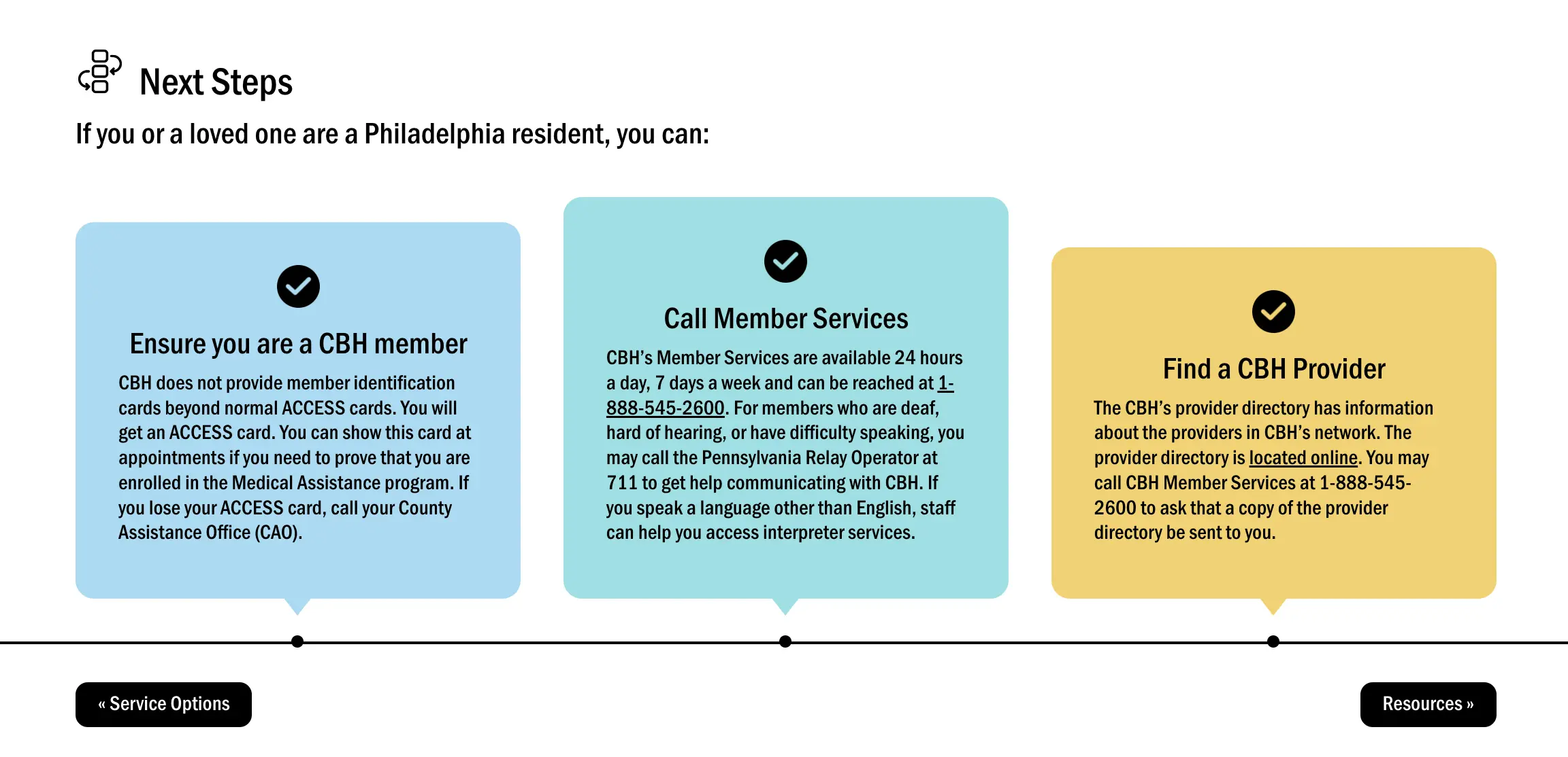
Defining desired outcomes for the Member Journey microsite was a challenge as users were not guided to complete a form, sign-up for more information or complete a transaction. The final navigation evolved to include clear next steps to ensure users would begin the process of accessing treatment, with a primary call-to-action to contact member services clearly defined.
Evolving User Interface Elements
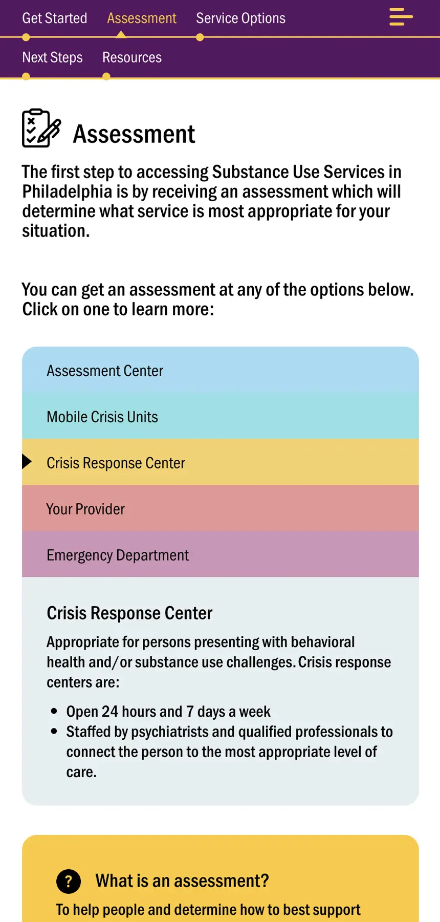
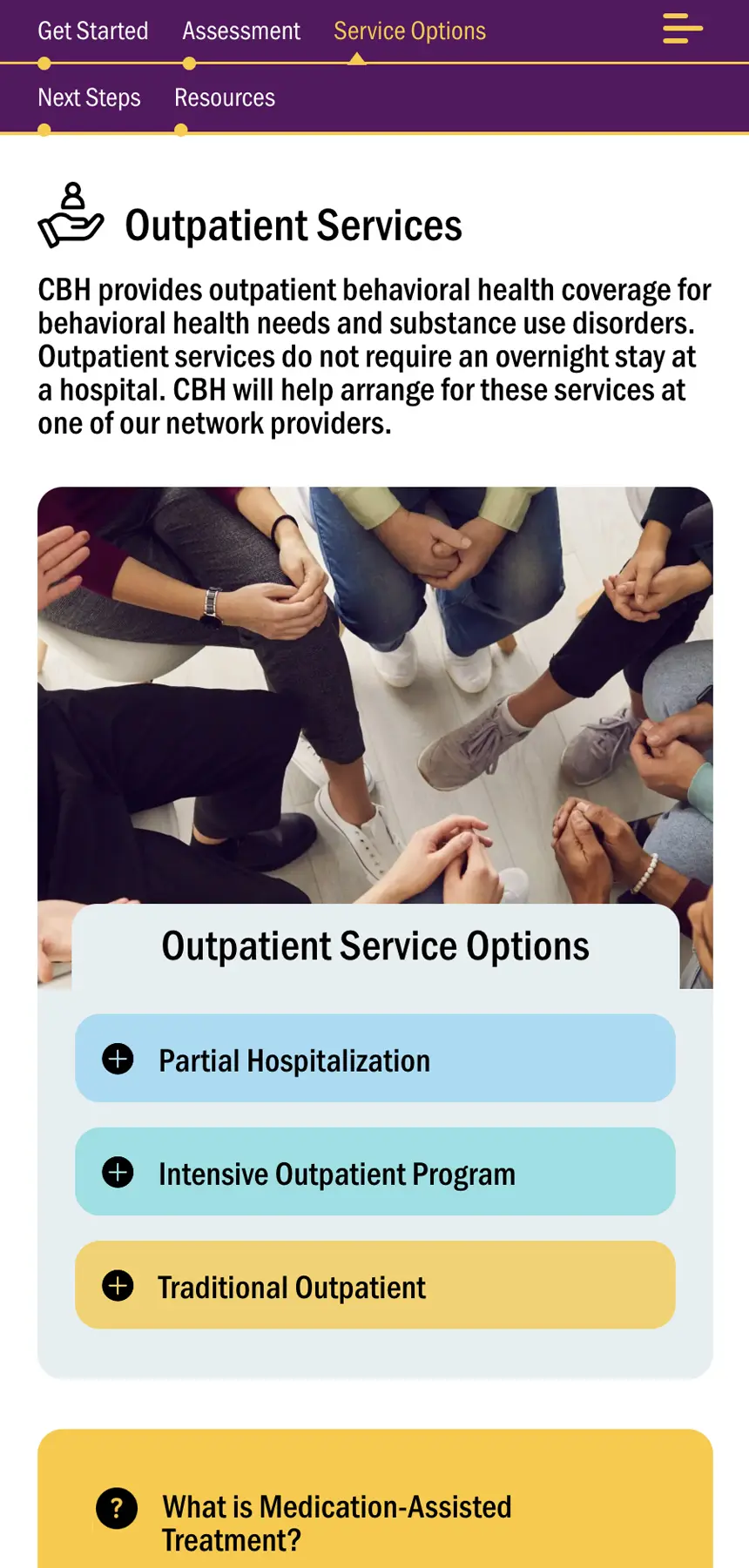
The dense handbook materials were edited and adapted for content modules in which users can easily access critical information. The final microsite features a range of collapsible modules, along with accordions, tooltips, and hover displays. This design system ensures a straightforward and user-friendly experience.
Seamless User Experience for Mobile
The fully-responsive, mobile experience of the Member Journey microsite was an integral component to the evolution of the design from the start of the project. The assumption was that most members would be accessing the Member Journey through mobile devices. So it was paramount that the on-screen navigation and collapsible content work as seamlessly on small screens as it does on larger desktop displays. The result is an effortless, speedy mobile experience that provides users with critical information about essential services.
Client Care Impact
Since its launch in early 2024, the Member Journey microsite has been well-received by members. It has become a go-to resource for the Community Behavioral Health Member Services team who guide members through the process of understanding treatment options as well as matching them with providers within the system. Its anticipated that the complete CBH Member Handbook will be converted into unique, individual online experiences using the Substance Use Services Member Journey as a template.
